Personal Brand from 0 to 1: A Complete Brand Identity Guide
Over the past few years, as a brand consultant and UI/UX designer, I’ve helped international brands and tiny one-person studios alike. Along the way I noticed something familiar: many people rush to get a beautiful logo, or hunt for a pretty typeface, before they’ve given the brand a personality to wear.
In order to be irreplaceable one must always be different.
— Coco Chanel
What is brand identity, really?
Brand identity is how people recognize you — how you show up in the world, how you sound, and the feeling you leave behind. Logo, color, type, and messaging. When those pieces stay consistent, someone can glance from afar and think, “Ah, that’s you.” That quiet familiarity often becomes trust.
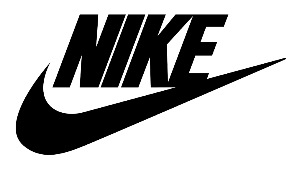
It carries your core values and stories. Nike’s “Just Do It” still works because it makes you feel sport, adventure, and the courage to move forward.
Five steps toward a professional brand identity
Step 1 - Understand Brand Value
I’d love to sit with two questions first: who are you, and what do you want people to feel. That includes your values, who you’re speaking to, and where you stand in the market.
Try answering these:
- What’s your brand positioning?
- Who do you want to serve — and who will feel drawn to you?
- What’s the core feeling you most want to convey?
- Compared with others, what’s uniquely yours?
Take Nike, for example
- Market position: a leading global sports and athletic brand
- Audience: people who care about health, movement, and challenge — fans and athletes
- Core values: whoever you are, you can push past your limits
- What sets it apart: “Just Do It” gives you a gentle nudge; innovation and style live inside the product
Inspiration can come from everyday preferences, how you live, and small real moments — you don’t have to squeeze yourself into a “this is what a brand should look like” template.
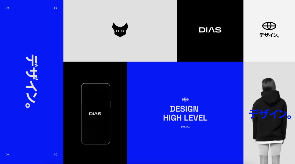
Credit: Felipe Dias
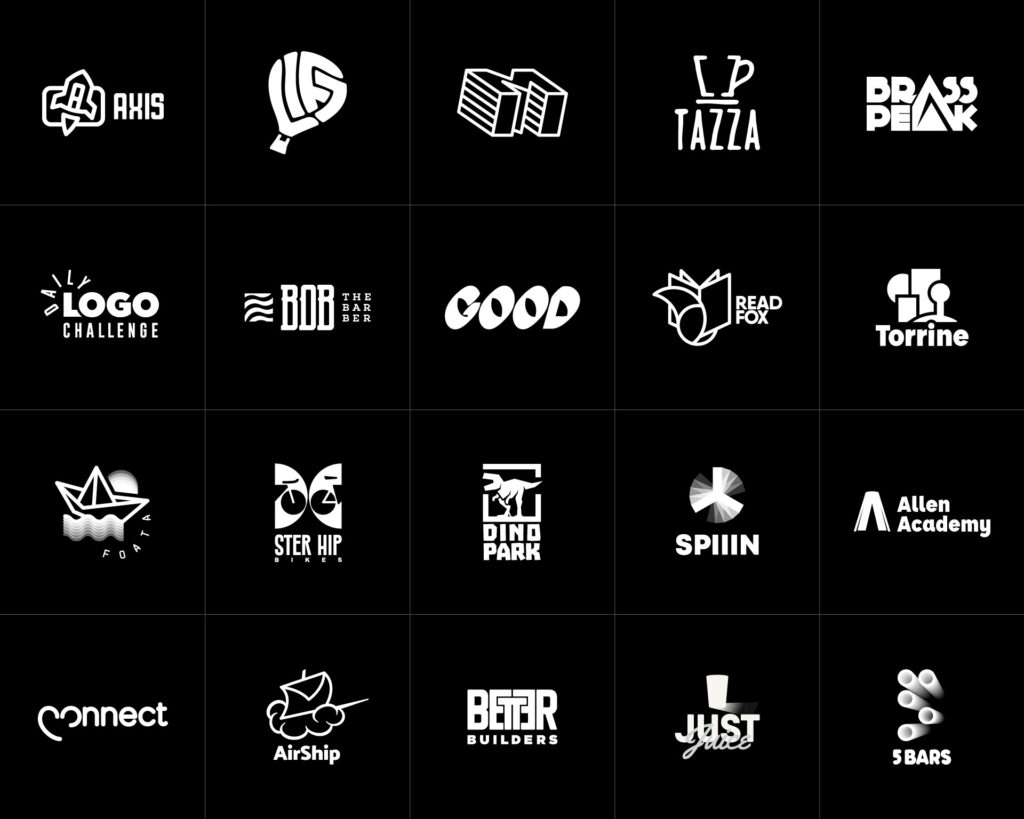
Step 2 - Design a Distinctive Logo

A logo is often a brand’s first glance. Apple’s bitten apple is simple, clear, and full of character — so you know it from far away.
Before you start designing, here’s a short checklist:
- Simplicity: Less is more. A little less is often easier to remember and easier to use
- Distinctiveness: Difference is what leaves a mark
- Representation: the shape should gently echo the brand’s core values
- Black and white first: without color, is the logo still clear?
- Flexible and responsive: it should stay readable on cards, websites, social avatars, and posters — and include a simplified version for tight spaces
If you’d like to linger on the details before logo design, read: 7 Logo Design Principles Every Designer Should Know
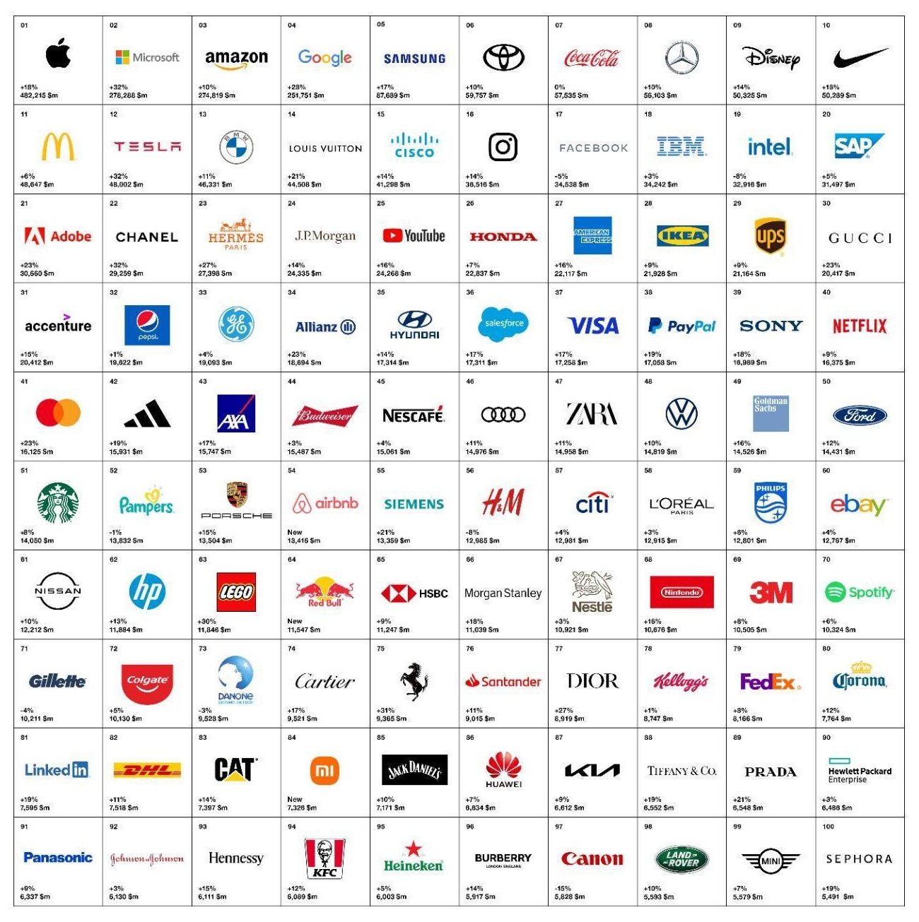
Interbrand Best Global Brands 2022
Step 3 - Choose Color & Typography
Brand color
Color moves feeling. Your primary color should stay close to what you want to convey: red often carries warmth and energy; blue tends to feel trustworthy. Most brands pick one main color and one or two supporting hues — enough consistency, without getting dull.
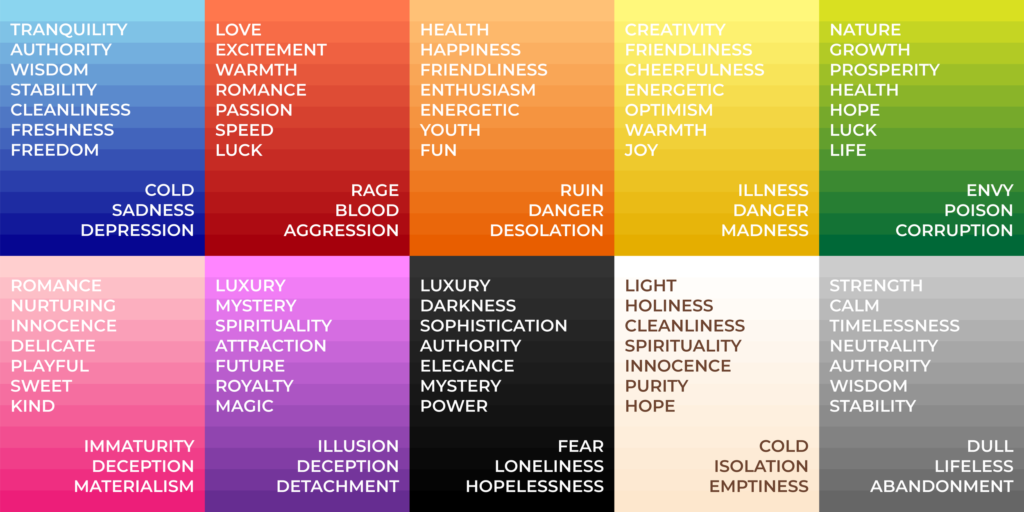
Color Meaning Chart by Serena Archetti
Brand typography
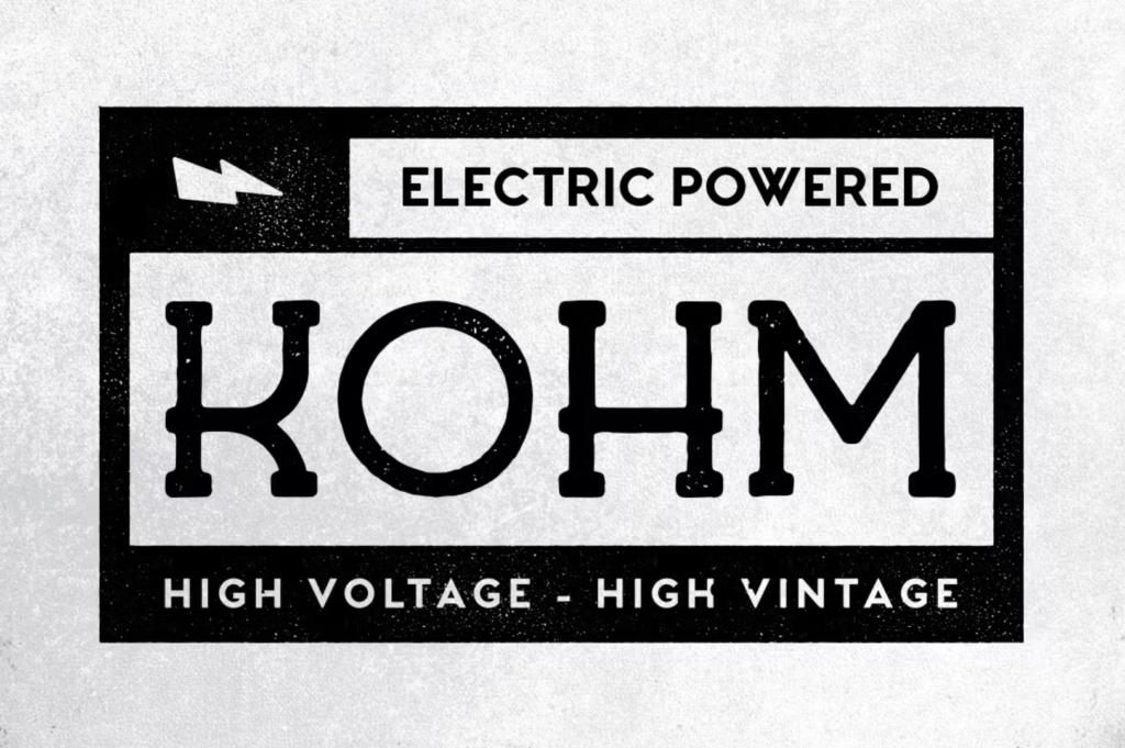
Type should feel comfortable to read, and a little like you. You don’t need a custom font; what matters more is the same style everywhere — website, business card, social posts. When you choose, look at real layouts and notice the rhythm between headlines and body text.
Step 4 - Shape Brand Messaging
Messaging is really about how you speak: what you say to the people you care about, and the tone you use.
- Define the brand story: where you come from, where you’re headed, what you care about
- Write a clear brand statement: what help you bring, and what problem you’re here for
- Find a brand voice: humorous, formal, professional, or warm — something that actually sounds like you
- Stay consistent: website, social, and marketing copy should share the same temperature
On social, the most important thing is still staying real. Sharing your unique story tends to feel more honest — and lasts longer — than posting a pile of images that only look “correct.”
Step 5 - Write Brand Guidelines
Once story, voice, and visuals are gently in place, write the shared rules into a brand guideline. Then you — and anyone working with you — can grow from the same system. Brand guidelines usually include:
- Logo usage: size, clear space, what’s allowed (dos) and what’s better avoided (don’ts)
- Color rules: primary / secondary, Pantone codes, and everyday contexts
- Type and layout: sizes, hierarchy, and small layout notes
- Image style: the direction for photography or illustration
- Voice and tone: how copy is written, and how you speak to your audience
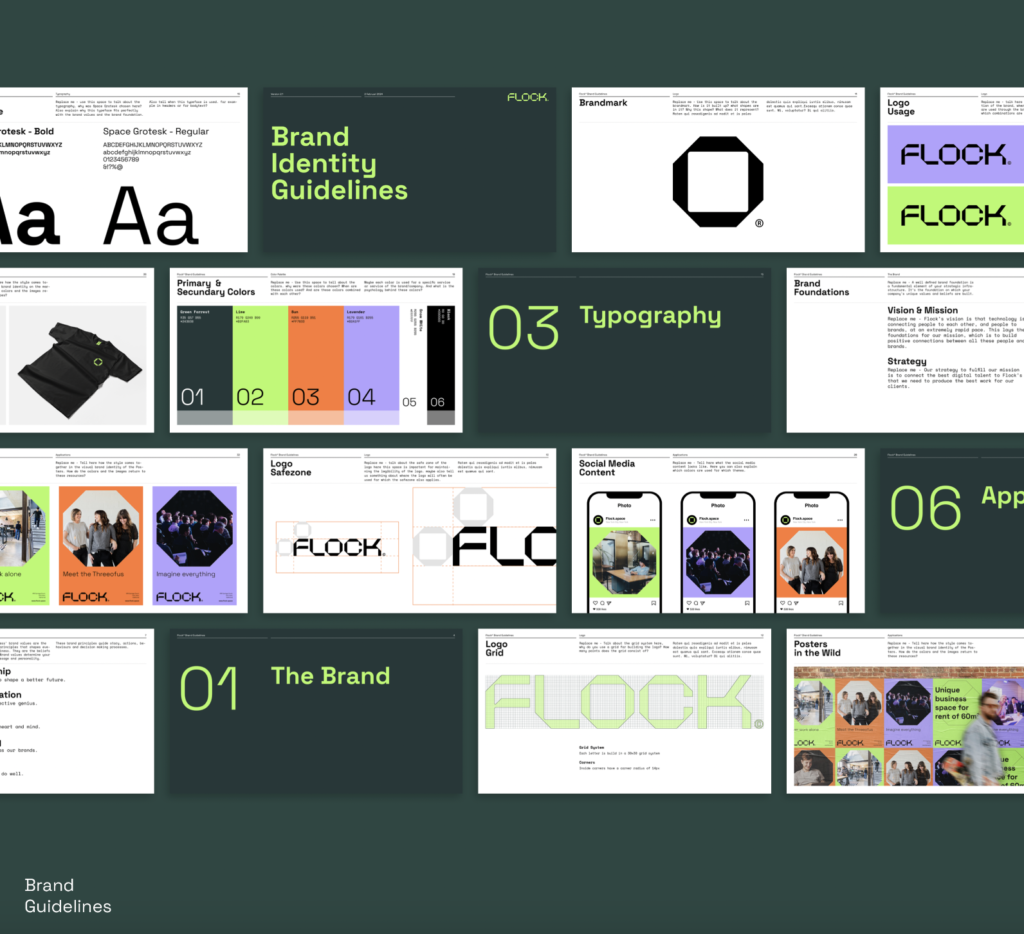
Cred: Typefool — the Brand Guidelines for Flock gather logo, color, type, social layouts, and more in one place.
Go live: let your website become the brand’s first home
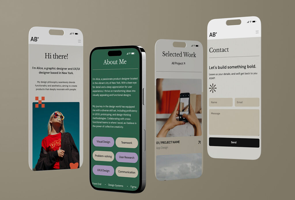
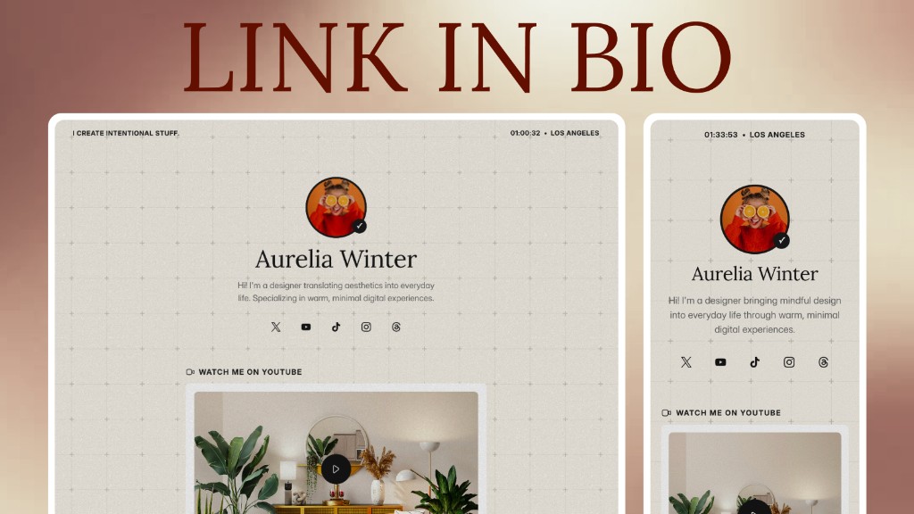
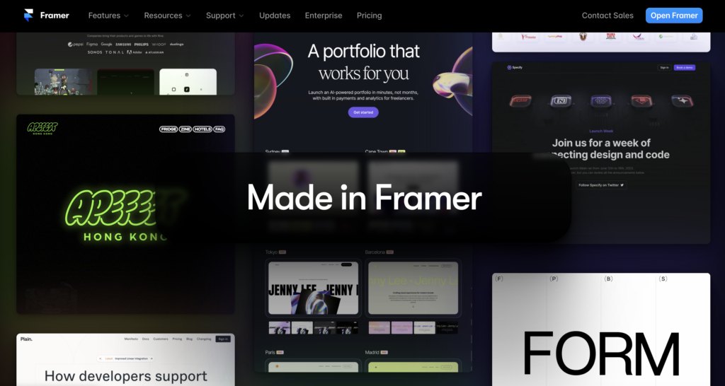
When visuals and content feel ready, it’s time to build your first site. To me it’s like a personal brand’s “home” — not fully steered by one social algorithm, and a place where trust and search visibility can grow a little each day. A few common builders:
| Tool | Best for | Strengths | Watch-outs |
|---|---|---|---|
| Framer | Personal portfolios, startup sites, one-page campaigns | Canvas editing, design-to-launch in one flow, rich micro-interactions; see the Framer review | Advanced features (custom code, CMS limits) often need paid plans; weaker for large e-commerce |
| WordPress | Content blogs, mid-to-large e-commerce | Highly open and flexible, huge global share, rich plugin ecosystem, strong SEO for the long run | Steeper learning curve; hosting, updates, and security are on you |
| Webflow | Designers who want deep customization and refined motion | High visual freedom, logic close to real HTML/CSS, clean performant output | Steep learning curve; you need basic layout logic |
| Squarespace | Photographers, artists, designers who care about visual polish | Refined templates, elegant and intuitive UI | Layout customization is more limited — harder to leave the template frame |
| Wix | Budget- or time-limited teams, first-time builders | Beginner-friendly, flexible drag-and-drop, many ready business templates | Code can feel heavy; migrating later is hard |
You don’t need the “perfect” tool on day one. Choose something you can actually return to, update, and dress in your brand identity — then refine as you go.
Give the brand a little time — it grows day by day
Brand identity isn’t a sticker you apply once and leave alone. Markets shift. The people you meet shift too. Don’t wait for version one to be perfect before you launch — take the first step; there’s plenty of room to polish later.
If you’re willing to spend time on positioning, visuals, messaging, and your website, the brand slowly becomes something that can attract people and keep them. The process is quietly lovely, like watching a small tree grow.