
Framer Portfolio Tutorial: From Figma Design to Published Site
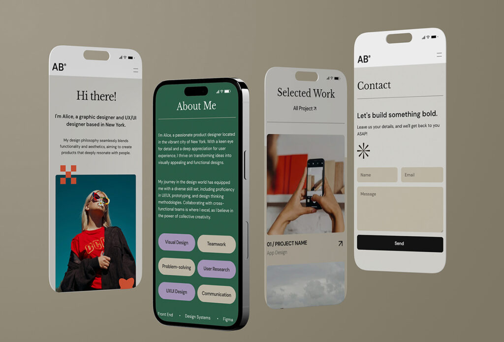
Putting together a portfolio means making a lot of decisions before you even open a design tool. Which projects belong in it? How much context does each one need? And how do you turn the finished layouts into a website you can share?
This article follows my process from planning pages in Figma to building and publishing them in Framer. If you'd prefer to start with an existing layout, I've also collected five free Framer portfolio templates.
A PDF is useful when an application asks for an attachment or someone needs an offline copy. A website is convenient when you want to keep updating your work and share it through a link. For this project, I chose a website and linked to it from my résumé.
In my experience, preparing a portfolio website can take close to a month, including research, deciding how to present the work, choosing a platform, organizing projects, and writing copy.
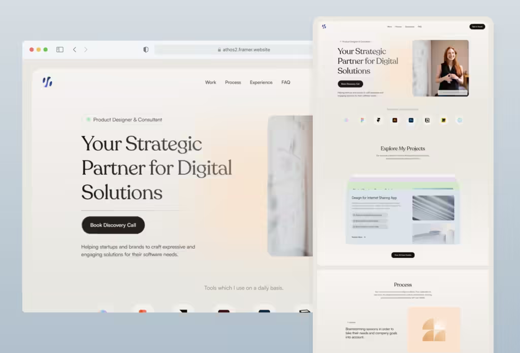
This Framer template took me about a week to make. That's the time I spent on this particular template, rather than an estimate for every portfolio project. I could adjust the pages directly on the canvas without writing code.
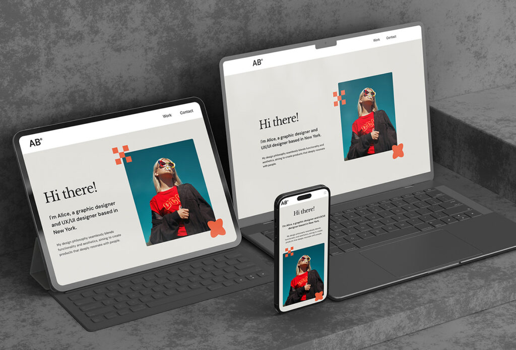
Here's the result: lnlstudios – Framer Portfolio Template
Framer is a visual website editor with publishing built in. For this project, I used the Figma to HTML with Framer plugin to bring over my design, then adjusted the pages for different screen sizes.
Before you start designing
I started in Figma so I could work through the content and page structure together. You can also edit a template directly in Framer; a separate Figma file is optional.
- List the projects you want to include and the background, decisions, and results each one needs to explain.
- Use Auto Layout to organize the Figma sections. You'll still need to check spacing and responsive behavior after importing.
- Bring sections into Framer with the official Figma to HTML with Framer plugin. The official import lesson demonstrates the process.
Step 1: Build a wireframe
I first blocked out each page in Figma, using placeholders while I worked out the structure:
- Images: gray blocks
- Text: placeholder copy or simple lines
- Buttons: small dark rectangles
This let me see how much space the images and text would need, and where the page felt crowded. I adjusted those areas before choosing colors or typefaces.
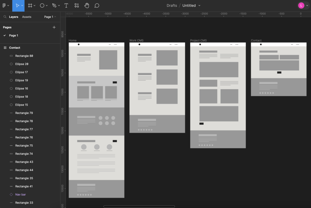
For this portfolio, that meant a homepage, a project index, case study pages, and a contact page — four page types to plan in wireframes.
Step 2: Test your copy
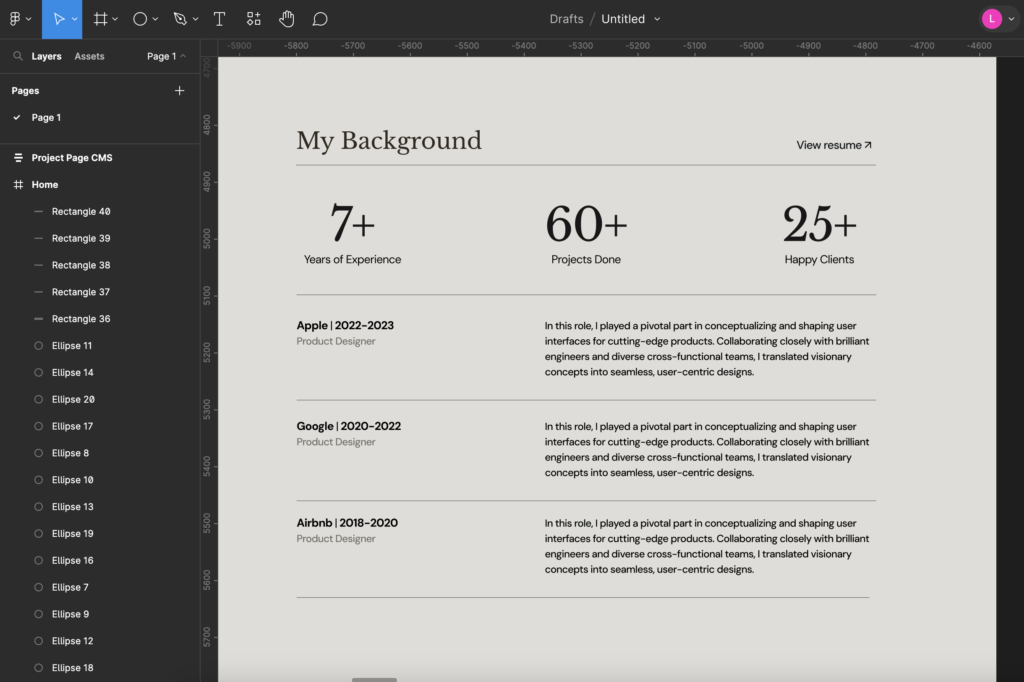
With the wireframe in place, I replaced the placeholder text with real copy. That made it easier to see which sections needed more room and which paragraphs were too long.
For the work history section, I grouped related information and adjusted the size and position of each block. Seeing the text in the layout helped me decide what to shorten.
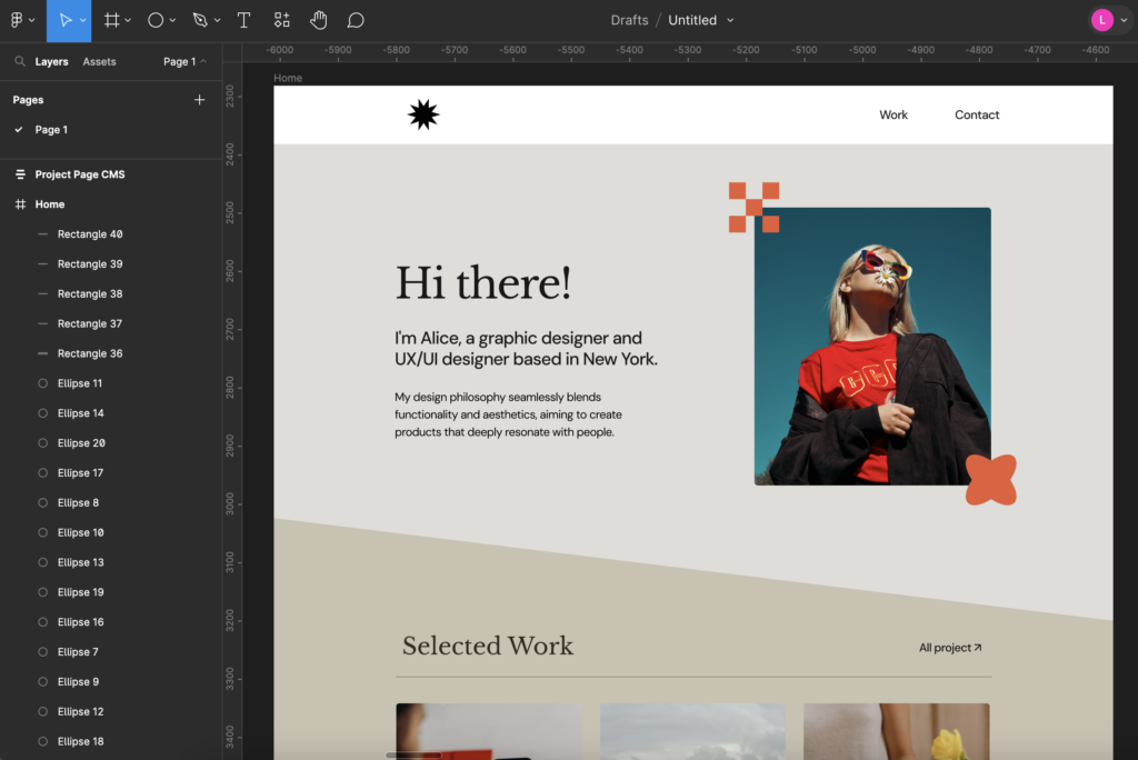
Step 3: Add the photos
Next, I added the images to the spaces I'd set aside. I checked whether they were sharp enough at the displayed size and how their proportions worked alongside the text.
Step 4: Start designing
This is my favorite stage. With the content prepared, I could start working on colors, typography, and supporting graphics. These are a few Figma plugins I've used for that part of the process:
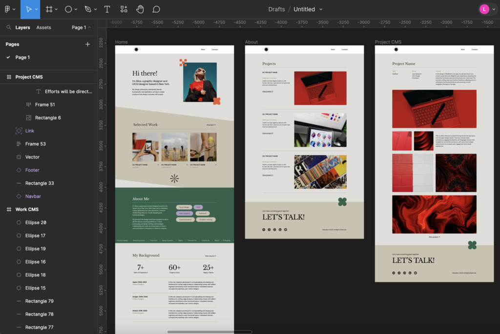
Step 5: Figma to Framer
Once the Figma design was ready, I used Figma to HTML with Framer to copy one section at a time onto the Framer canvas. Smaller batches made it easier to check the fonts, images, and spacing after each import.
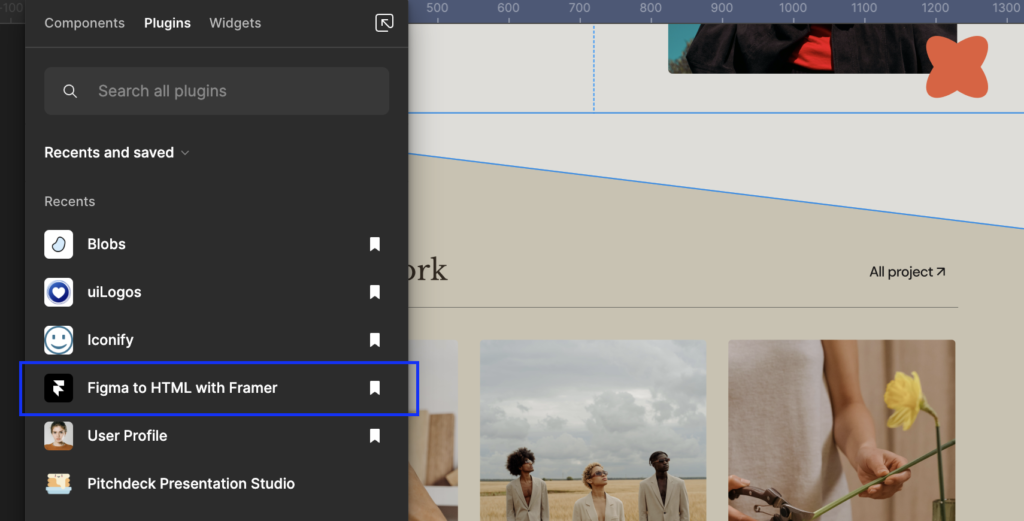
After pasting a section into the project, I checked its text, images, and layers before moving on to responsive adjustments.
Step 6: Build the responsive site in Framer
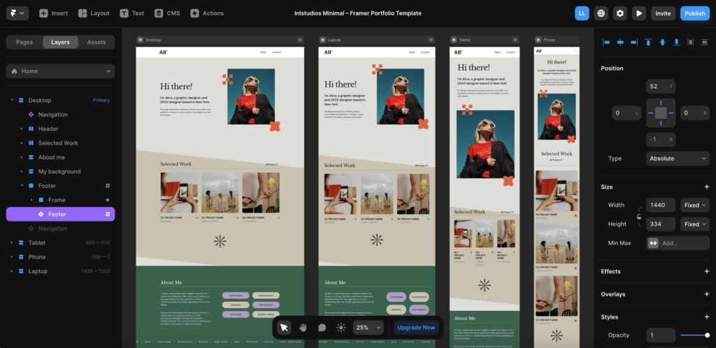
I checked the pages at desktop, tablet, and phone widths. I also checked a laptop width, where images and text that had plenty of room on a larger screen could become crowded.
I made the main layout flexible first, then adjusted individual breakpoints where needed. It's worth checking the widths between those breakpoints, too.
Step 7: Set up animation
I added animation to buttons and a few other elements in Framer, starting with the desktop layout. Then I reviewed the results on tablet and mobile. Existing settings could carry over, but I still checked how they looked at each size.
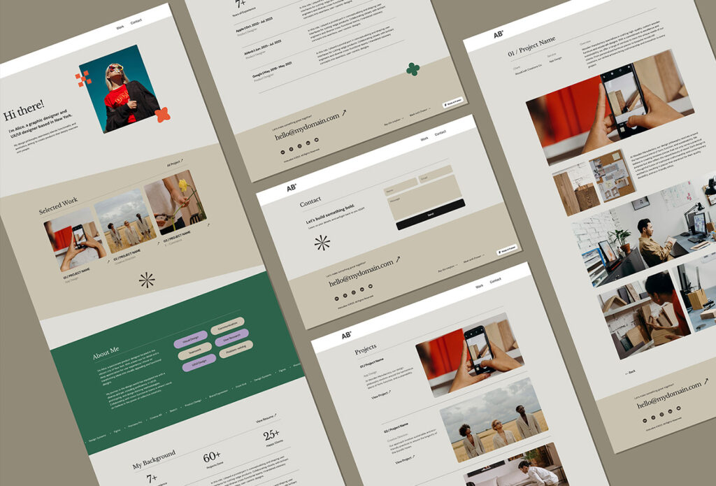
Final result
You can preview the finished Framer portfolio to see how the pages came together.
Before sharing your own site, check the navigation, project links, and contact details. Open it on your phone and read through a full project page.
If you'd like to start from a template, browse my five free Framer portfolio templates or explore more Framer templates. Choose one that fits your projects, then replace the work, introduction, and contact details with your own.
Related Posts
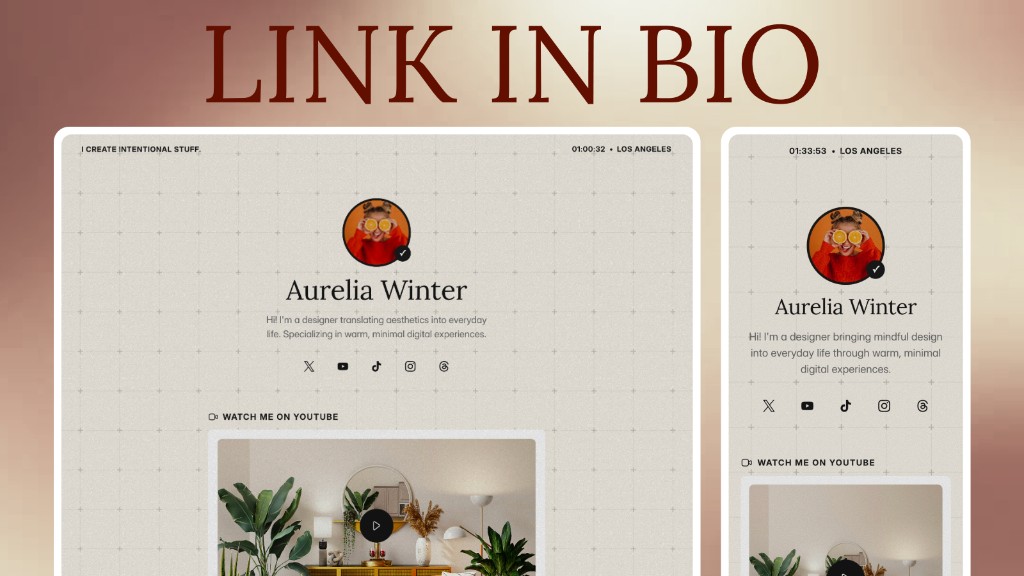
Build a Link in Bio with Framer Agent: Process and Free Template
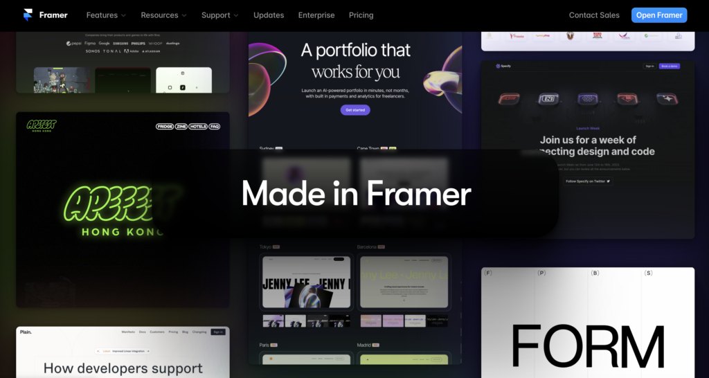
Framer Review: Features, Pros and Cons, and Who It's For
Framer 3.0: The AI Agent Understands Design Better Than I Expected
5 Free Framer Portfolio Templates to Boost Your Interview Odds

Framer Template Guide: The Simplest No-Code Way to Launch a Site