

7 Logo Design Principles Every Designer Should Know
Most people start logo design by hunting for inspiration or sketching too early — and get lost along the way.
Why logo design should not start with drawing
Thinking before design matters more than inspiration
Thinking before design matters more than inspiration alone.
A logo is the most precise language a brand can speak.
Most people jump straight into mood boards or sketches and quickly lose direction.
A strong logo needs a clear story — including brand positioning, visual direction, use cases, and how audiences will interpret it.
This article collects the seven principles I use most often in brand projects, so you can start from the right foundation before you design.
Having a great logo is like having a child who brings good fortune.
Further reading:
5 AI Logo Generators Tested for Small Brands
Step-by-Step Brand Identity Design
What a strong logo design can give you
- A memorable first impression: helps the brand be recognized quickly and easily. As the saying goes, “a picture is worth a thousand words.”
- A professional image: a logo signals how professional a brand feels. Even if your product is beautifully designed and highly functional, a careless logo can still make people walk away.
- The right formats and flexible variations: a good logo needs room to grow — it should stay clear on websites, print, packaging, and products.
- Strong long-term ROI: designing a great logo may cost time or design fees up front, but it is an excellent investment. A strong mark can attract more customers and deliver positive returns over time.

A classic story worth sharing: the Nike logo
In 1971, Nike founder Phil Knight hired a student, Carolyn Davidson, at $2 an hour to design a logo for Nike.
Inspired by the wings of the Greek goddess of victory, Davidson spent 17.5 hours designing the now-iconic “swoosh.” Her total fee was $35 (about $257.54 in today’s dollars) — often cited as one of the cheapest big-brand logos ever made.
Today, Nike’s success and recognition are tightly tied to that mark. The swoosh has become a global symbol of sport and innovation, helping make Nike one of the most valuable and influential brands in history.
What gives a logo real “brand feeling”
In today’s competitive digital landscape, companies and individuals need to work harder to stand out.
1. Start with brand positioning
To make sure a logo reflects a brand’s core values, goals, and positioning, researching and analyzing brand needs is an essential part of the process. It helps the logo fit current goals while staying relevant over time. Through deeper analysis and strategy, designers can better capture what makes a brand distinctive — and create a mark with more depth.
2. Find the right visual direction
Design trends come and go, just like seasonal fashion. Some styles endure; others fade quickly. Keeping up with trends is useful, but relying on them completely is risky — blindly following trends can make a brand look dated fast.
Understanding current design trends is fine; they can be one source of inspiration. What matters most is using your imagination to find the tone that fits the brand, so the logo feels timeless.
The 99designs Team publishes an annual report on graphic design trends.
3. Design the logo in black and white first
To make sure a logo still works in its simplest form, start in black and white — without color. Imagine a company that only allows black-and-white printing to save budget: your logo still needs to survive that constraint. Designing a monochrome version has several advantages:
- Visual clarity: without color distraction, you can see shape, structure, and detail more clearly.
- Print and application flexibility: a black-and-white logo performs well across print and usage contexts, without color conversion issues.
- Brand recognition testing: monochrome helps you test whether the design is strong and distinctive enough to express the brand without color.
- Color-blind friendliness: a black-and-white mark is more accessible because it does not rely on color differences to communicate.
Once the black-and-white version works, then add color. That sequence helps the logo stay effective and readable across contexts.
Credit: Marius Lascu
4. Responsive design: which use cases must a good logo pass?
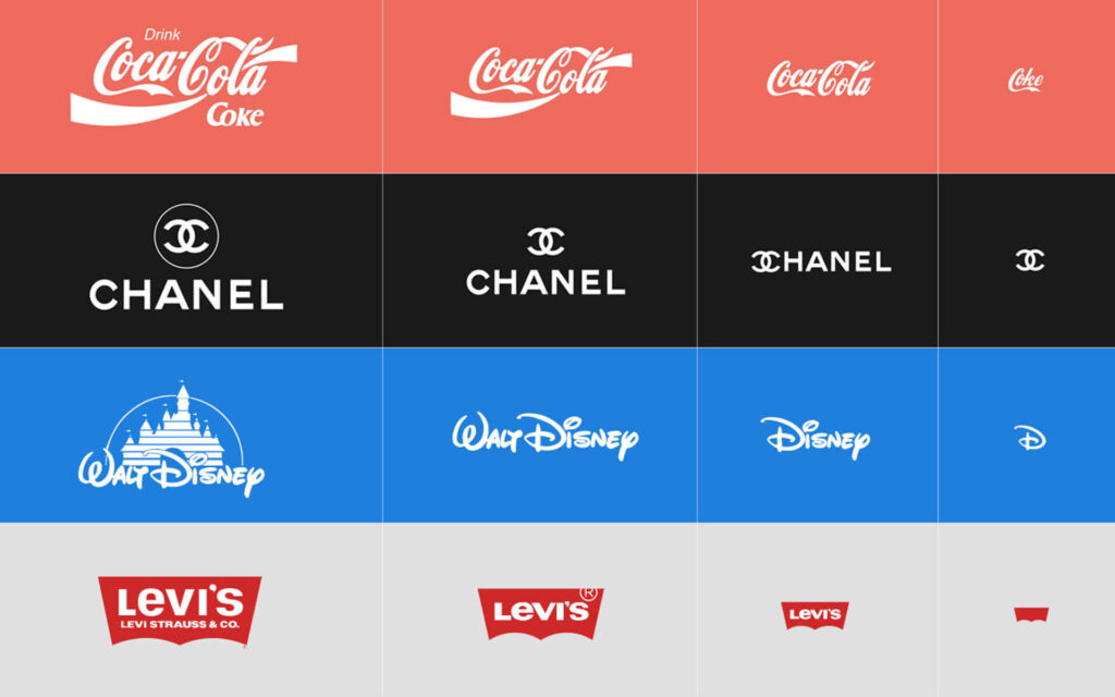
Your logo may appear on business cards, websites, social avatars, posters, and products. To stay clear at every size, you need responsive design. That does not just mean scaling the same lockup up or down — it means designing for context. You might need a 1:1 mark for an Instagram profile photo, and a horizontal lockup for posters. When space allows, use the full logo; when space is tight (for example on mobile), use a simplified version.
5. Think beyond the obvious
Design logos with creativity and originality so the mark stands out among brands while still communicating character and value.
Amazon’s logo is a strong example: simple, clever, widely recognized, and conceptually sharp. The orange arrow feels warm and friendly; it stretches from “A” to “Z,” suggesting the company sells everything from A to Z; and the smile signals that customers feel happy with the service.

6. Pursue minimalism
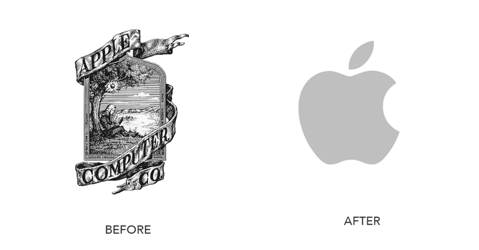
Minimalism is not just a style. It means using essential elements, removing excess, and clearly communicating brand value and character.
Design a simple, clear, easy-to-understand logo so the brand can be recognized in an instant, remembered more easily, and rendered cleanly across media. Minimal marks also tend to feel sharp and professional, which helps build trust.
7. Choose color carefully
When coloring a logo, choose thoughtfully. Color plays a major role in brand image, emotional communication, and overall visual effect.
Different colors carry different emotions, so the palette should align with the brand’s image and intended feeling. For example, blue often communicates calm, stability, and trust — which is why many tech and finance brands use it — while red carries passion and energy, and appears frequently in toys or food.
Some colors may be trendy for a while, but that can also make a logo feel dated later. Choose colors that fit current needs and still hold up over time.
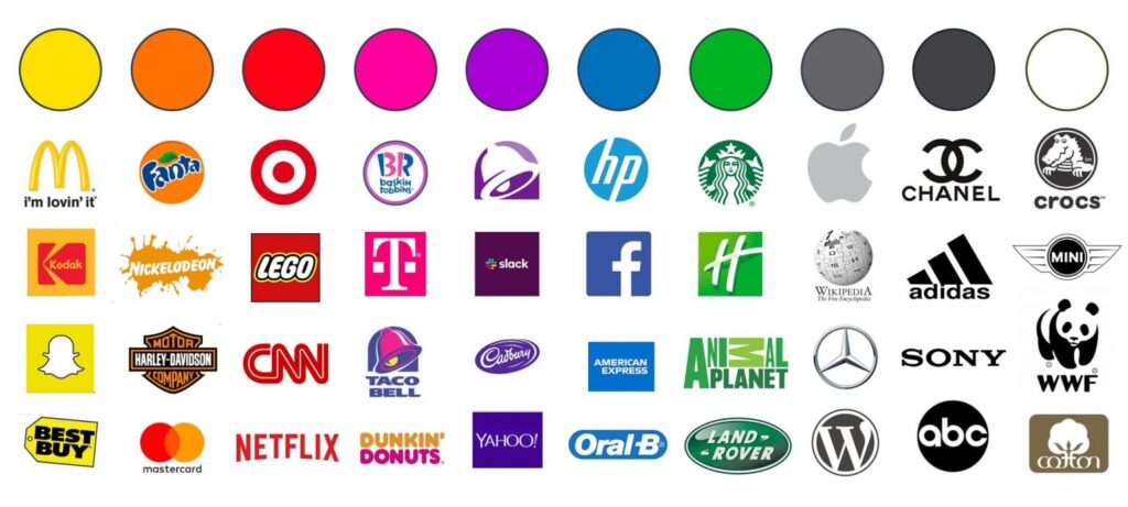
Credit: 1000Logos
Start designing your logo
These are the key principles to know before you design a logo. Strong brands are not built overnight, and a carefully designed logo is one of the essential pieces — it can bring more visibility and revenue, and help people trust the brand. Practice makes progress. Follow these seven core principles, and you can create a logo that truly works.